RETAIL KIOSK / LEAD UX DESIGNER
Making key-copying easier at a self-service kiosk.
Customers needed to understand which key service to choose and what they were paying for.
I led the end-to-end experience and wireframed the journey, partnering with a design-system engineer, UX writer, and illustration and animation team. Larger controls, clearer choices, and service explanations addressed uncertainty at each step.
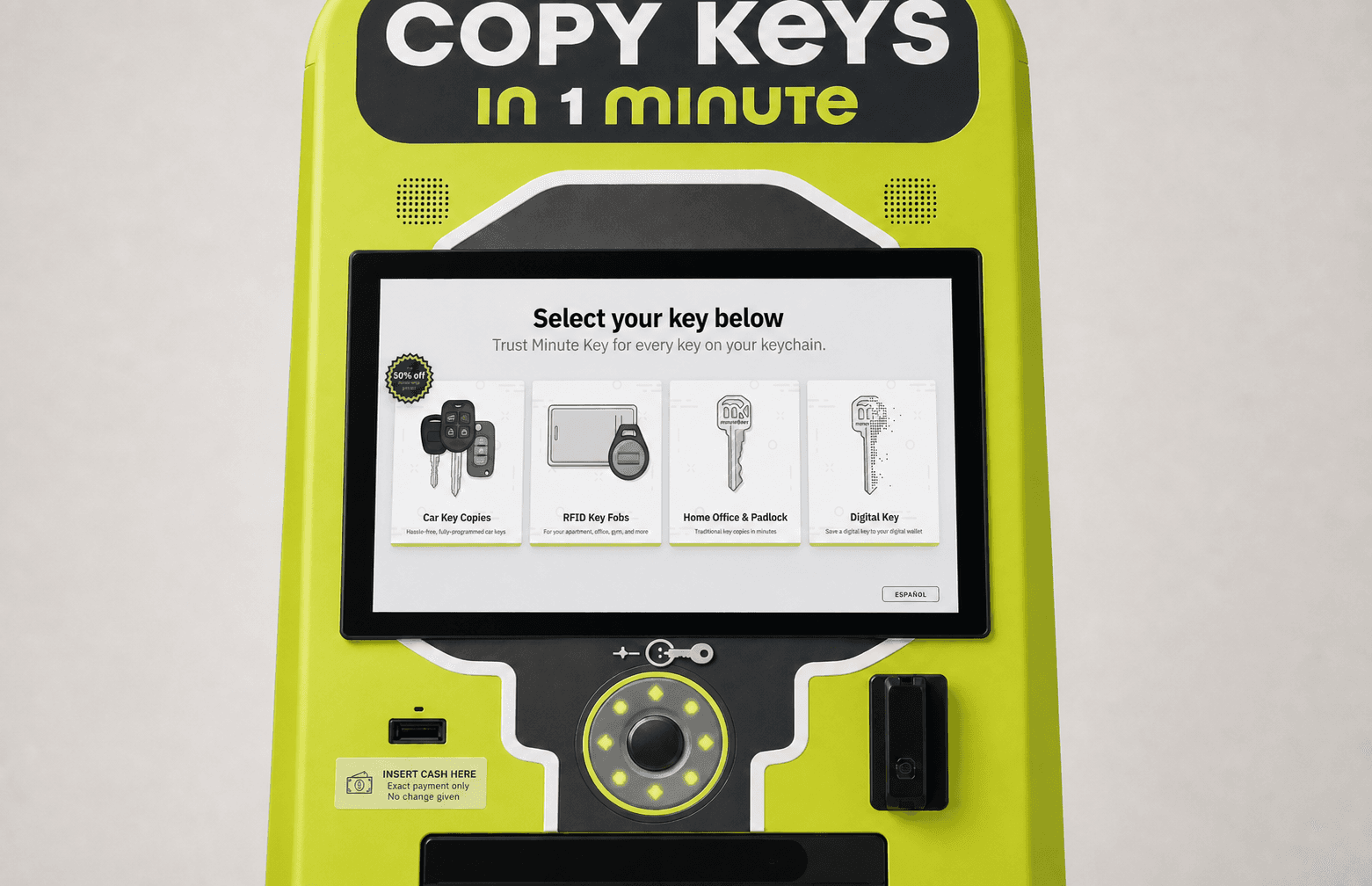
01 / THE TRUST PROBLEM
Make an unfamiliar purchase easier to understand.
The previous experience exposed too much system complexity at once. Customers were being asked to understand the machine while also making an unfamiliar purchase.
Customers needed clear choices and a way to go back.
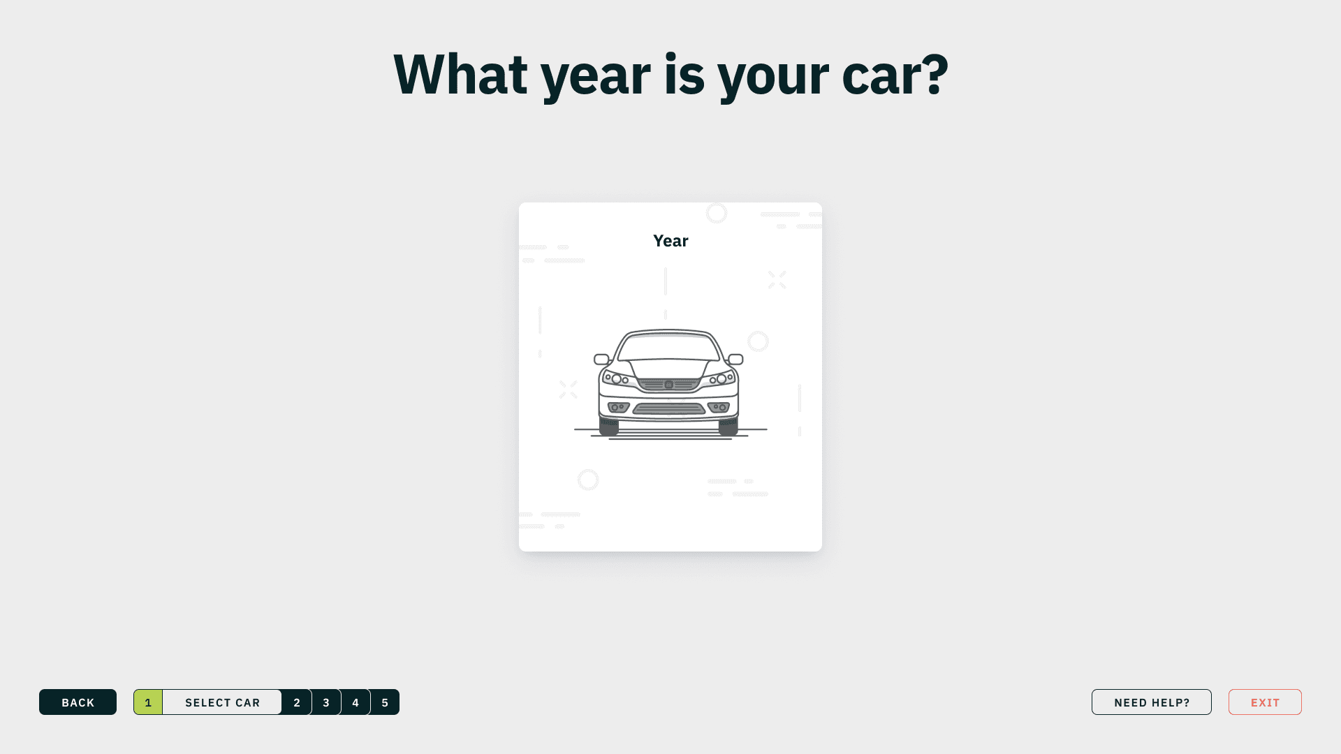
02 / THE STRATEGIC MOVE
Explain the service while the kiosk processes the key.
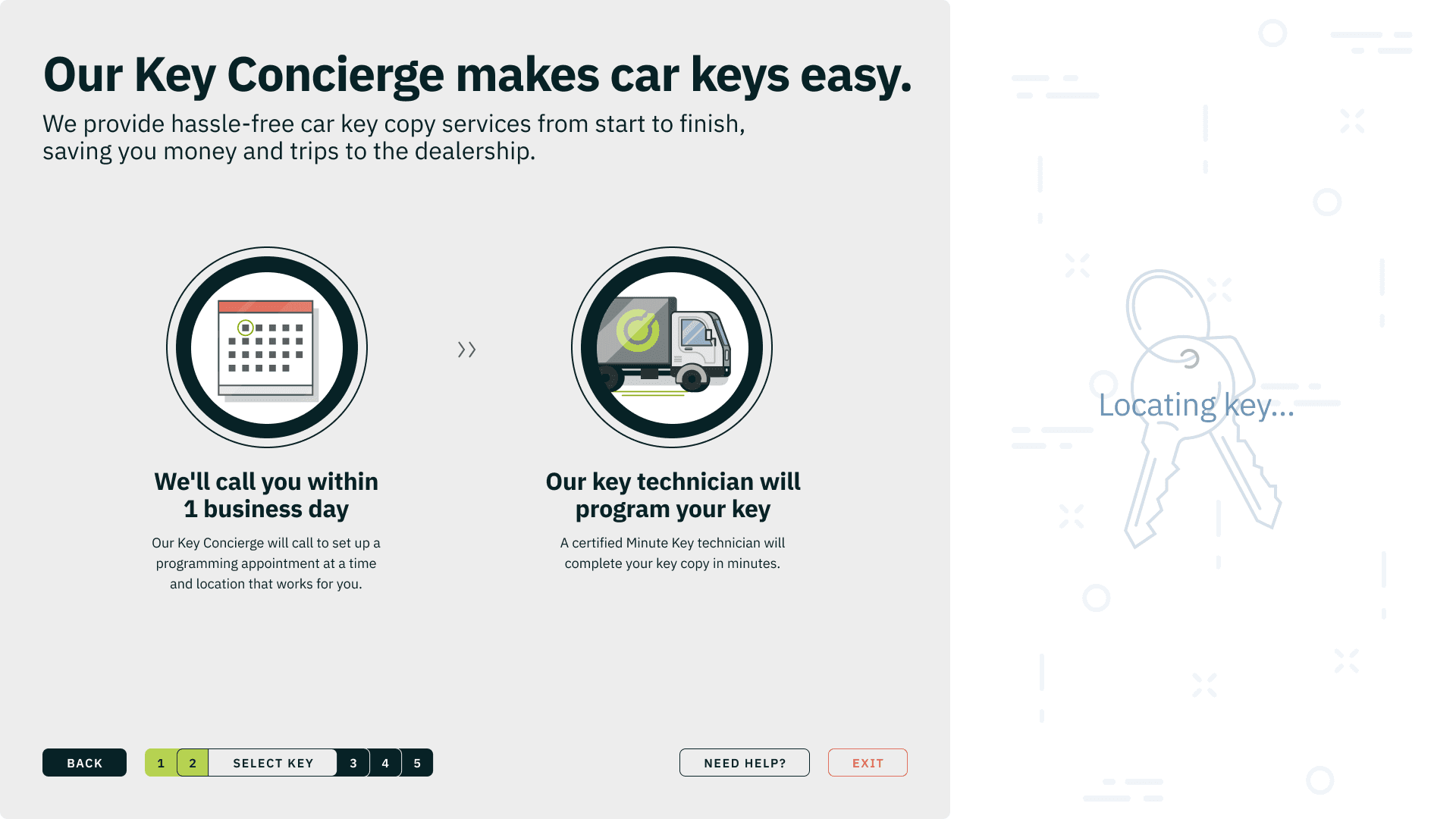
Smart and car keys require background processing. I used that unavoidable wait to explain price, quality, accuracy, and the white-glove service without adding another step.
- 01SIGNAL
The wait created doubt.
Customers were asked to trust an expensive service while the kiosk appeared to be doing nothing.
- 02DECISION
Make waiting useful.
Put the most reassuring proof inside the processing time instead of adding more screens.
- 03EXPERIENCE
Confidence without friction.
The product explains the service while continuing to locate and configure the key.
03 / ONE KIOSK, MULTIPLE SERVICES
The redesign had to make every kind of key feel understandable.
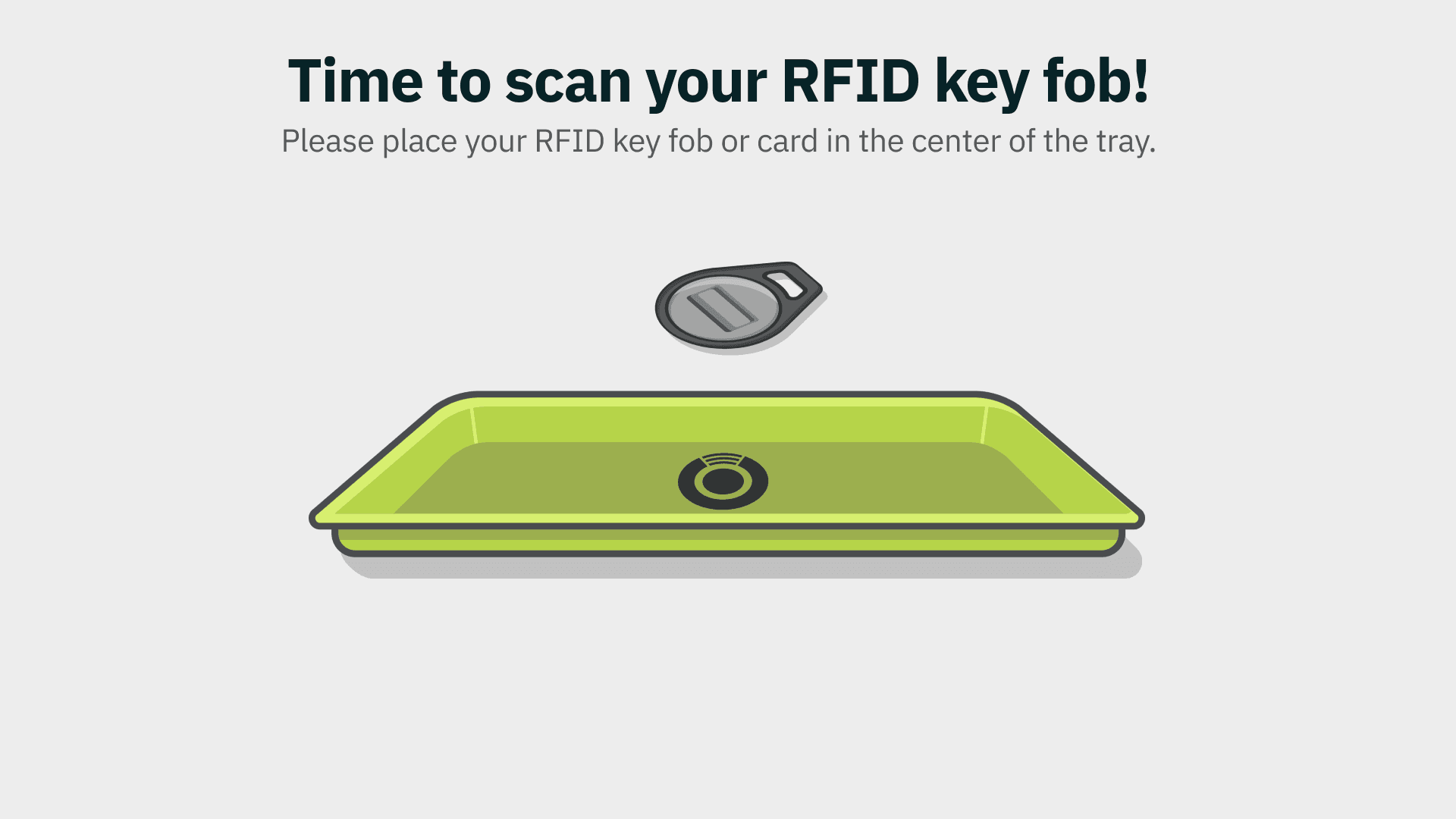
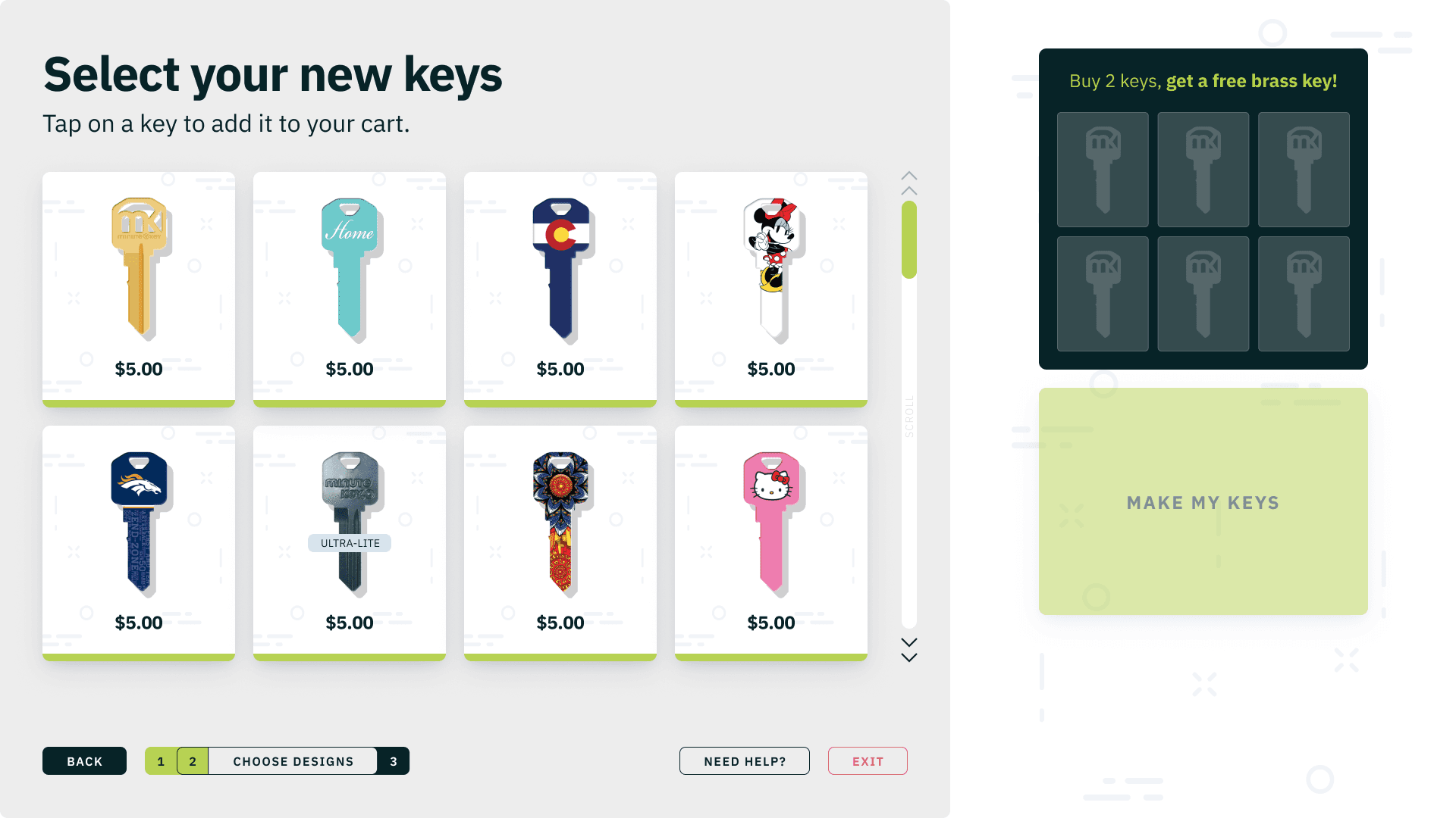
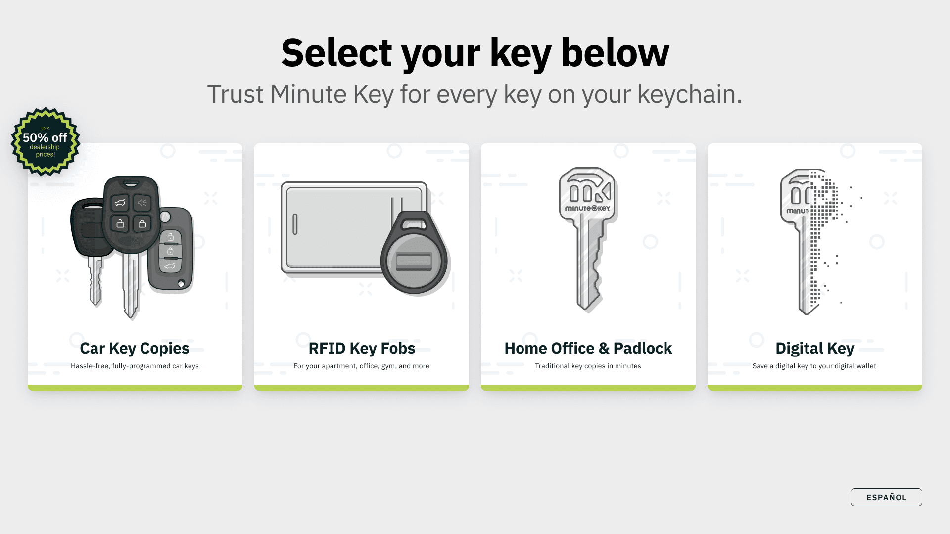
Car keys were only one part of the system. I also designed distinct paths for smart keys, RFID fobs, and house keys. Each came with different hardware, fulfillment, pricing, and moments of risk.
04 / LEADERSHIP + COLLABORATION
I pushed us to design for a kiosk instead of putting a website on a bigger screen.
I wireframed the full journey and worked with a design-system engineer on the UI. A UX writer and animation partners helped explain the service and physical instructions.
I advocated for larger touch targets suited to the 16:9 kiosk. We used the client’s research and interactive prototypes to review the behavior, animation, and pacing.
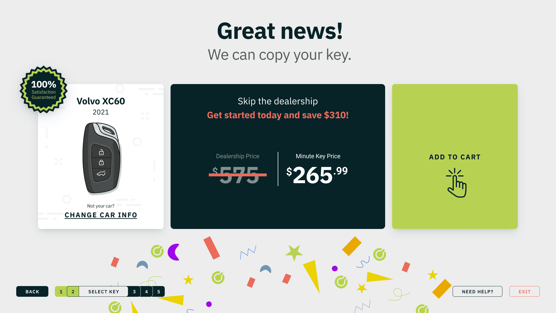
That mattered most for smart keys, which could cost around $600. We had to explain the white-glove programming service and make MinuteKey feel as credible as a dealership before asking for the purchase.
05 / FROM FLOW TO SYSTEM
Use a consistent sequence across key services.
The system established a common rhythm across traditional keys, transponders, smart keys, key fobs, and house keys. Each flow could carry different information without changing how customers understood progress.
ORIENT
Make the available key types immediately understandable.
NARROW
Turn vehicle selection into one clear decision at a time.
REASSURE
Use unavoidable wait time to explain quality and value.
CONFIRM
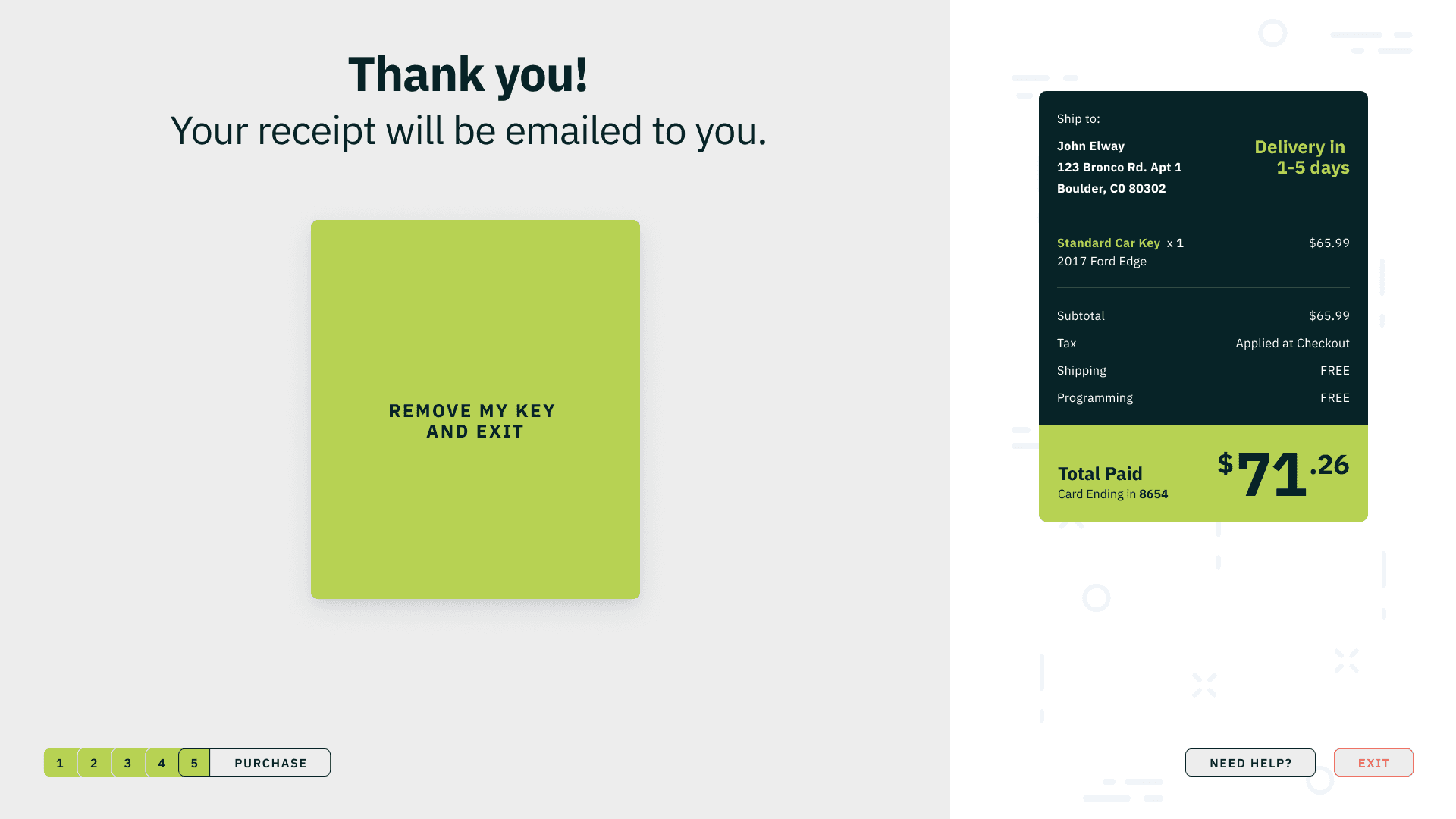
End with an unmistakable receipt, delivery promise, and exit.
Follow the connected kiosk journey from service selection through purchase.
06 / WHAT CHANGED
The core experience improved. Smart-key conversion moved from zero.
Our partner reported key-flow completion of 70% after launch, up from 62%, and car-key completion above its goal. Smart-key conversion reached 3% from zero. It remained below the 10% target, but established that people would purchase a high-ticket service through the kiosk. These are partner-reported results, not a controlled experiment.
- 70%
- KEY-FLOW COMPLETIONUP FROM 62%
- 33%
- CAR-KEY COMPLETIONVERSUS A 20% GOAL
- 3%
- SMART-KEY CONVERSIONUP FROM 0% · 10% TARGET
07 / REFLECTION
I would establish the confidence baseline before redesigning the next flow.
Completion improved after launch, but we did not measure customer confidence before and after the redesign.
Next time, I would measure perceived risk before launch and compare it with the completion results.